Patchwork
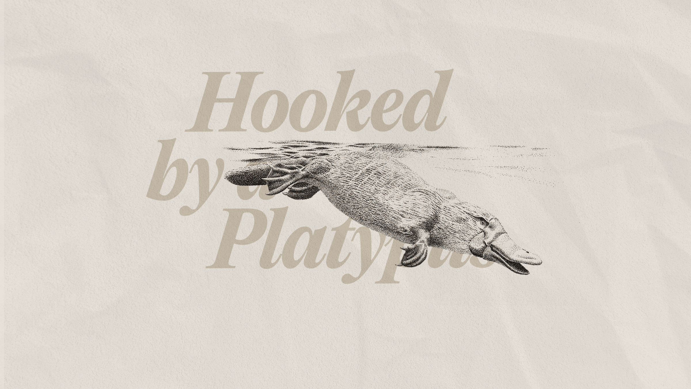
One of the most revered rules in logo design is to not combine too many ideas in the same mark. This doesn't stop a lot of designers from breaking it. I recently spent an entire conversation fixated on someone’s cap instead of listening to what he had to say. He was telling me about his new business, and all I could see was his logo. My eyes jerked from one element to the next. It was a mishmash of services and location, each in a different colour of the local flag. I was hooked—but not in the way he wanted. And I still couldn't tell you what he does.

This is what I call The Platypus Effect. Many people are drawn to patching together different items within their business. A bricklayer might want a logo of a brick wall with a person holding a trowel under a roof. A plumber might ask for a wrench and a pipe and a faucet with water drops inside a house. But the more things you patch together, the less effective your logo will be.
Put aside your urge to patch your services together.
When working on Oli's logo, I trashed many, many concepts. Most of them were surface-level ideas, showing one element or another of the healthcare industry. They had all the markers of a "good" logo, but they completely bypassed the complexity of Oli's mission. It wasn't until I started tackling a complex problem within the mark itself that the mission started shining through.
Oli was created by healthcare professionals who had firsthand experience with an outdated hiring process that causes staffing problems around the world. The mountain of paperwork, platforms and certifications involved for both administrators and healthcare professionals draws out the hiring process. It's an administrative nuisance with consequences that hurt everyone—hospitals overspend on overtime for staff who are spread too thin and patients don't get the care they need.
They analyzed every angle of the system and streamlined it. They now offer a portal for healthcare human resources—one that bridges the gap between administrators and professionals.
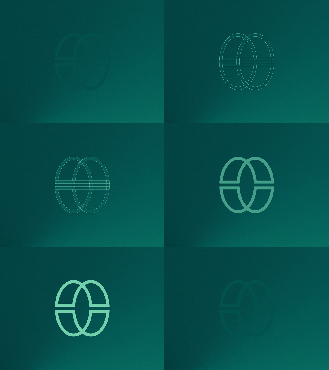
The final logo expressed the complexity Oli untangles, the bridge between the two audiences, and the concept of a portal—all wrapped up in an O monogram. The optical illusion signals Oli's ability to see every angle, while we may only see one perspective.
No one will catch all of that at first glance. But the meaning underneath carries Oli’s entire mission. And once you see it, you can't unsee it.
Notice what I didn't add: no nurses, no hospitals, no globe. Those are what Oli has and who it serves. The logo is about what Oli stands for. That’s the difference between a platypus and a distilled mark. One lists what a business has. The other says what it means.
That doesn't mean a platypus can't be good. The animal is delightful. But it took millions of years of evolution—and possibly some sort of higher power—to get it right.
When you're ready to tackle your own logo, put aside your urge to patch your services together. Instead, pick which messages matter most. Then, decide what you want people to think and how you want them to feel. An experienced designer will be able to translate that into a mark that hooks people for the right reasons.
_
See the Oli case study