

An identity for the shift that can't wait

Challenge
Healthcare software has a look. Clinical. Functional. Forgettable. It signals competence the way a waiting room does — adequately, joylessly, to no one in particular.
Oli was building something different. A platform ambitious enough to reshape how healthcare professionals manage their entire career — from new graduate to retirement — and how the organizations that need them find, hire, and retain them. The founding team had worked in healthcare long enough to understand the problem from the inside. The vision was clear.
The identity wasn't.
Approach
Wanderland Agency led positioning, strategy, and the website for the engagement; I was brought on for the identity — taking a strong strategic foundation and translating it into something you could see, hold, and recognize.
The starting point was the name. Oli is short for olive — a tree that survives adverse conditions, whose roots endure long after everything above ground is damaged. Resilience. Peace. Abundance. Royalty. The brief was rich with meaning. The question was how to carry it without announcing it.
Solution
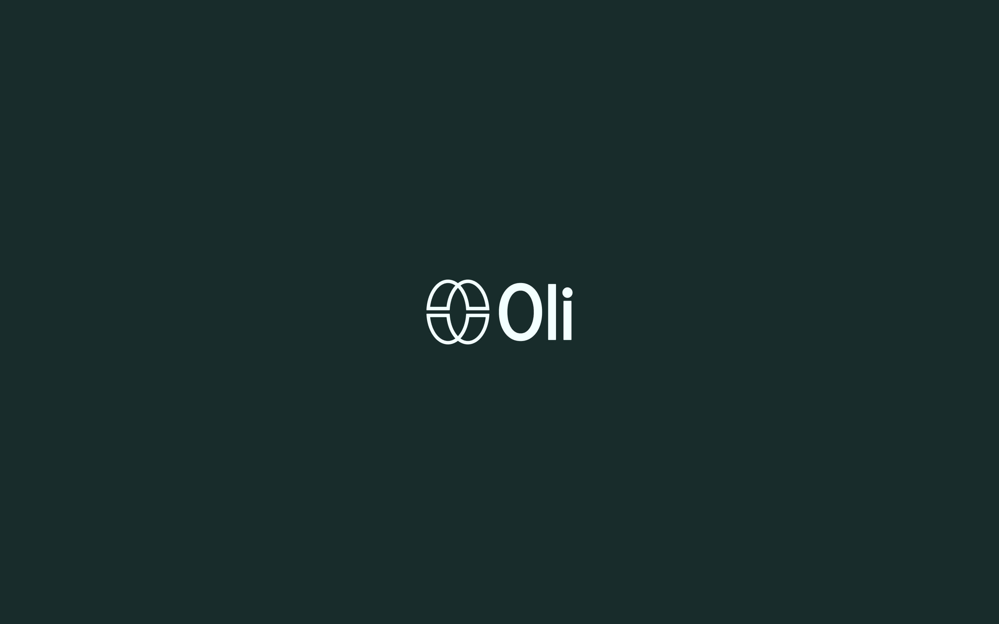
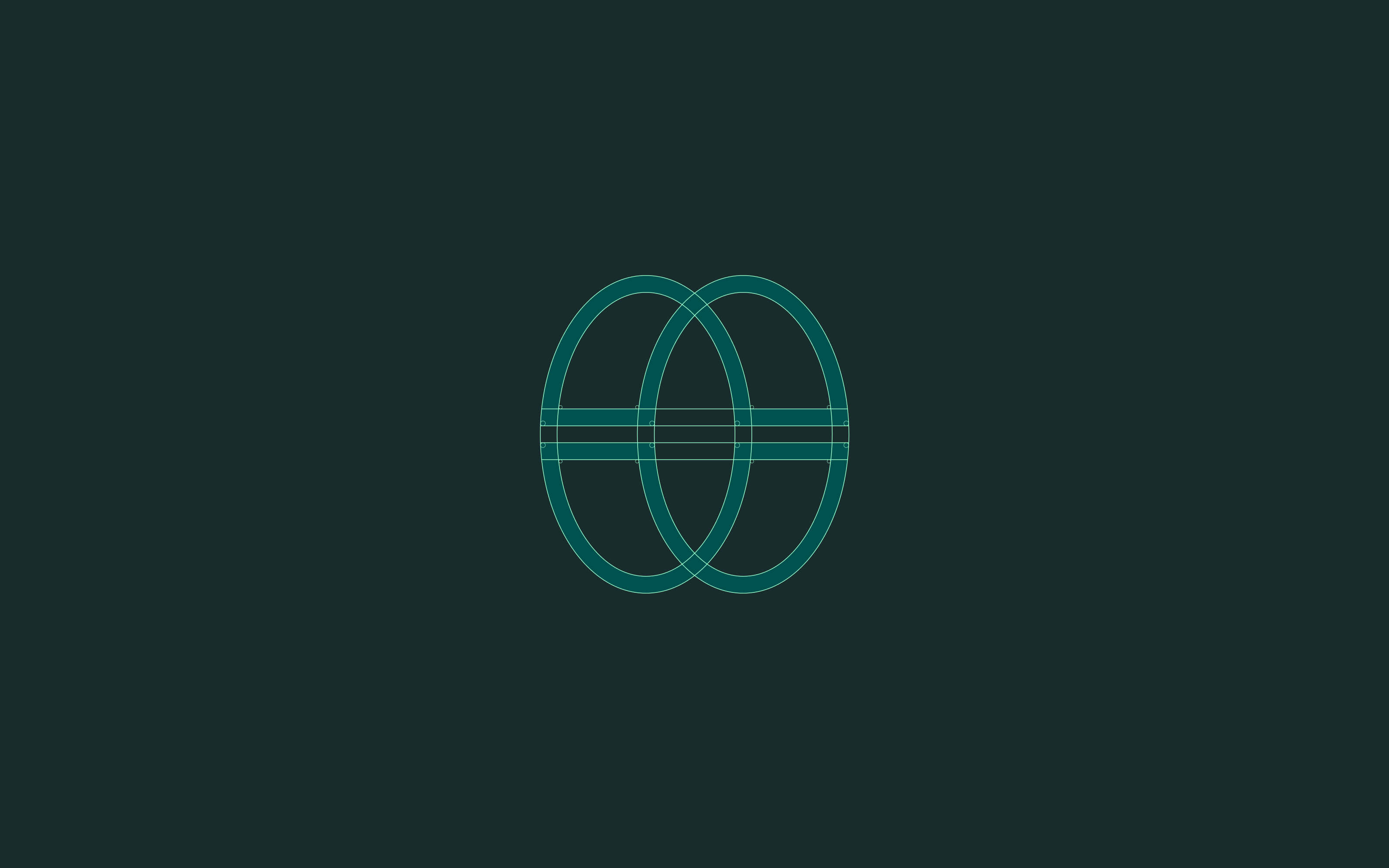
The brandmark is built from two overlapping forms — each complete on its own, together creating something new. Depending on how you read it, you see an O. An olive. A portal. Two worlds becoming one unified system.
The mark shifts depending on how you look at it. That's the point. Healthcare professionals hold multiple realities simultaneously. A logo that rewards that kind of attention is speaking their language before a single word is read.
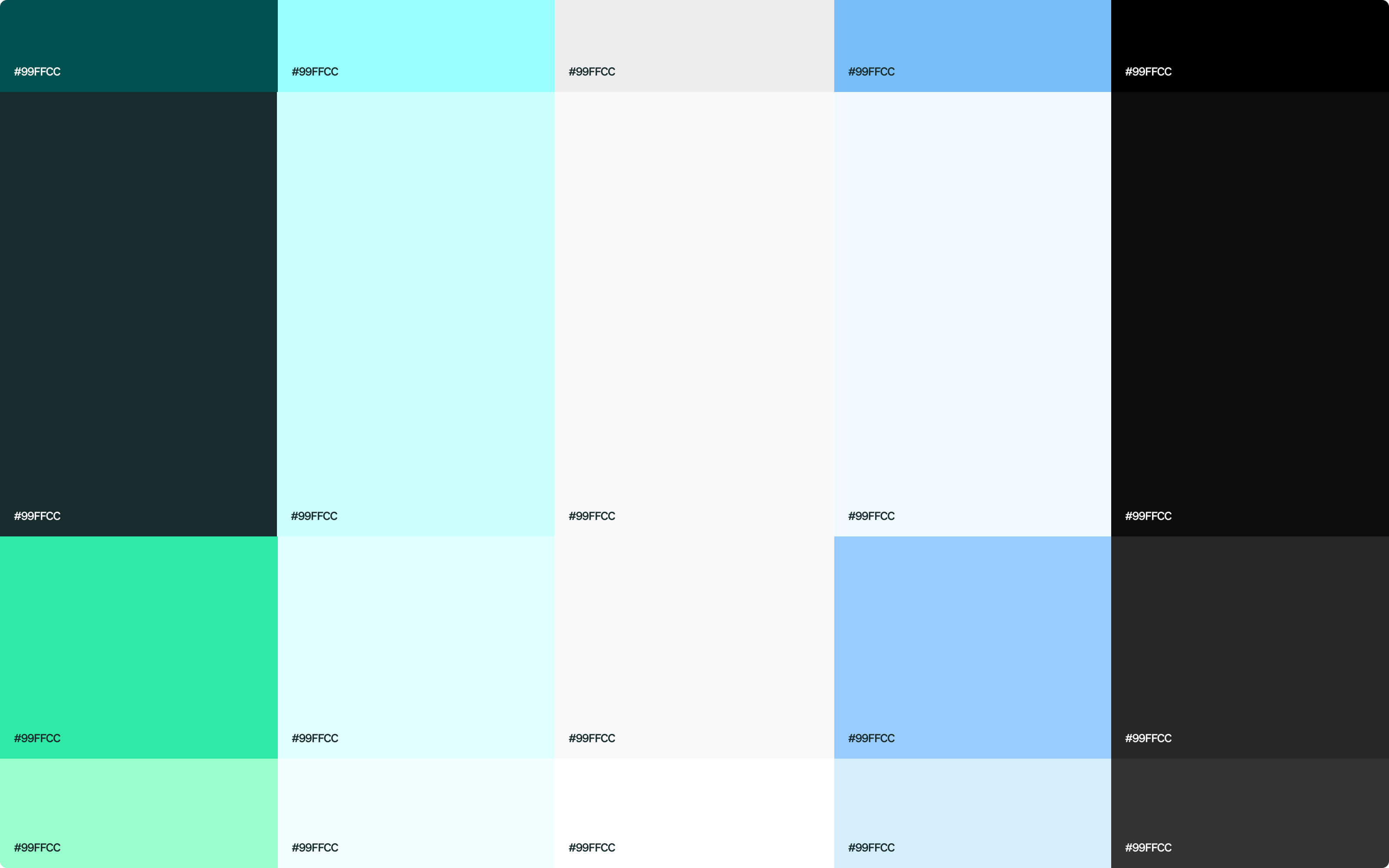
The colour system follows the same logic. Emerald Green carries premium, professionalism, and growth. Sky Blue carries trust, reliability, and connection. Together, they map quietly onto Oli's two audiences — the organization and the individual professional.
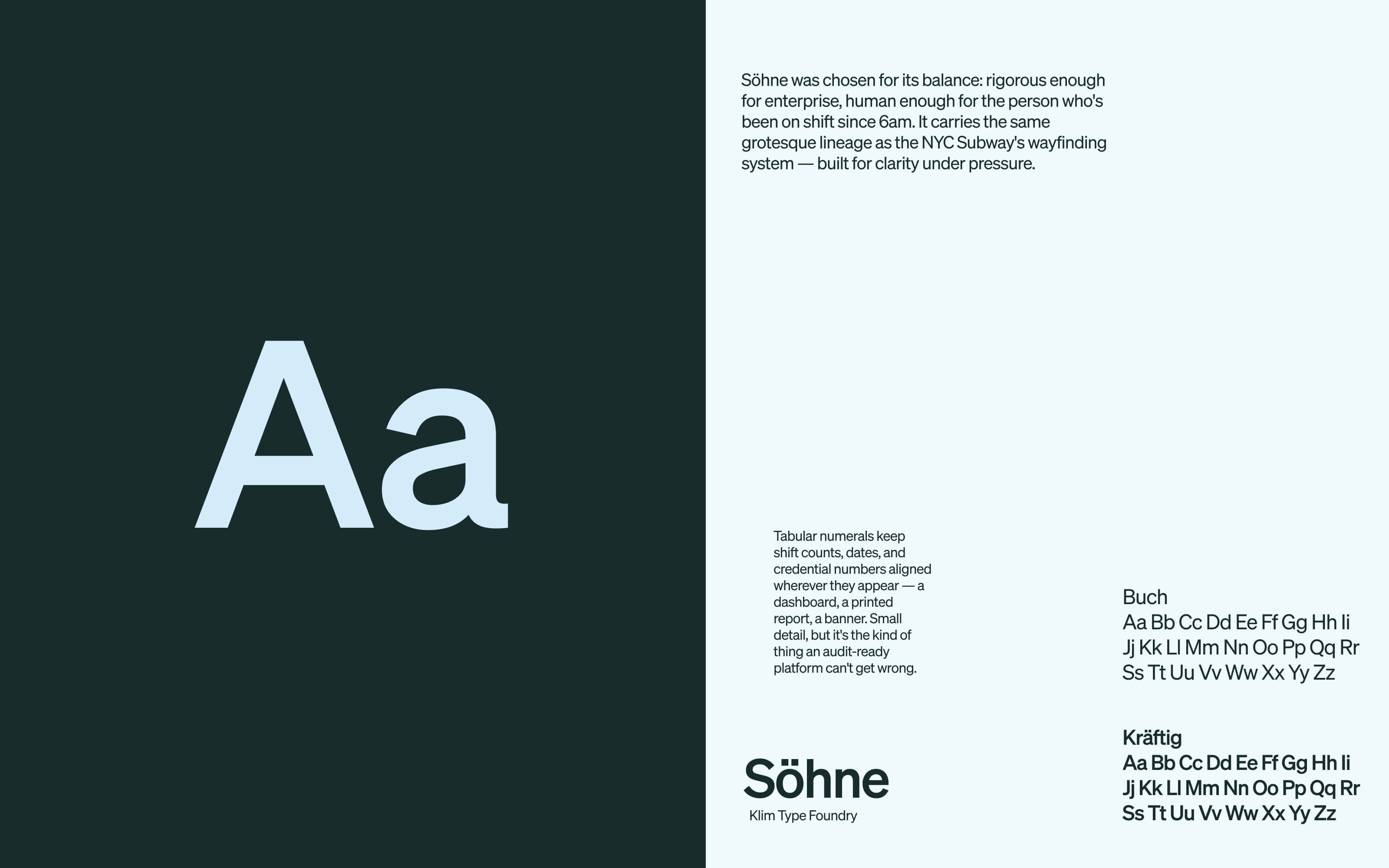
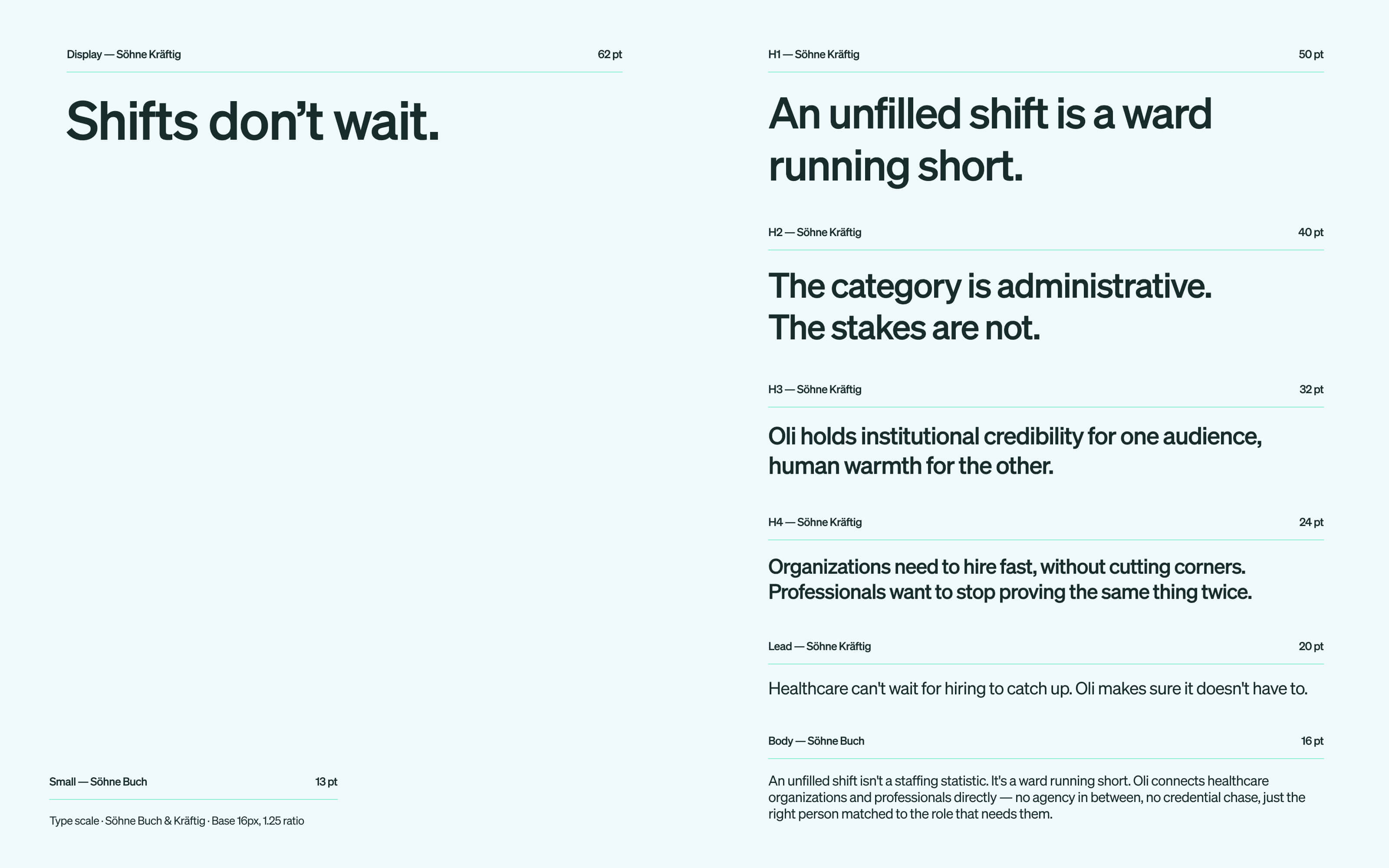
Söhne was chosen as the brand typeface. Rigorous enough for enterprise. Human enough for the person who's been on shift since 6am.
The custom icon set was built around Oli's actual product suite — OliPass, OliPortal, OliRate, OliScore — alongside the healthcare specialties the platform serves. Not decoration. A product UI language built around what Oli actually does.
Act Two
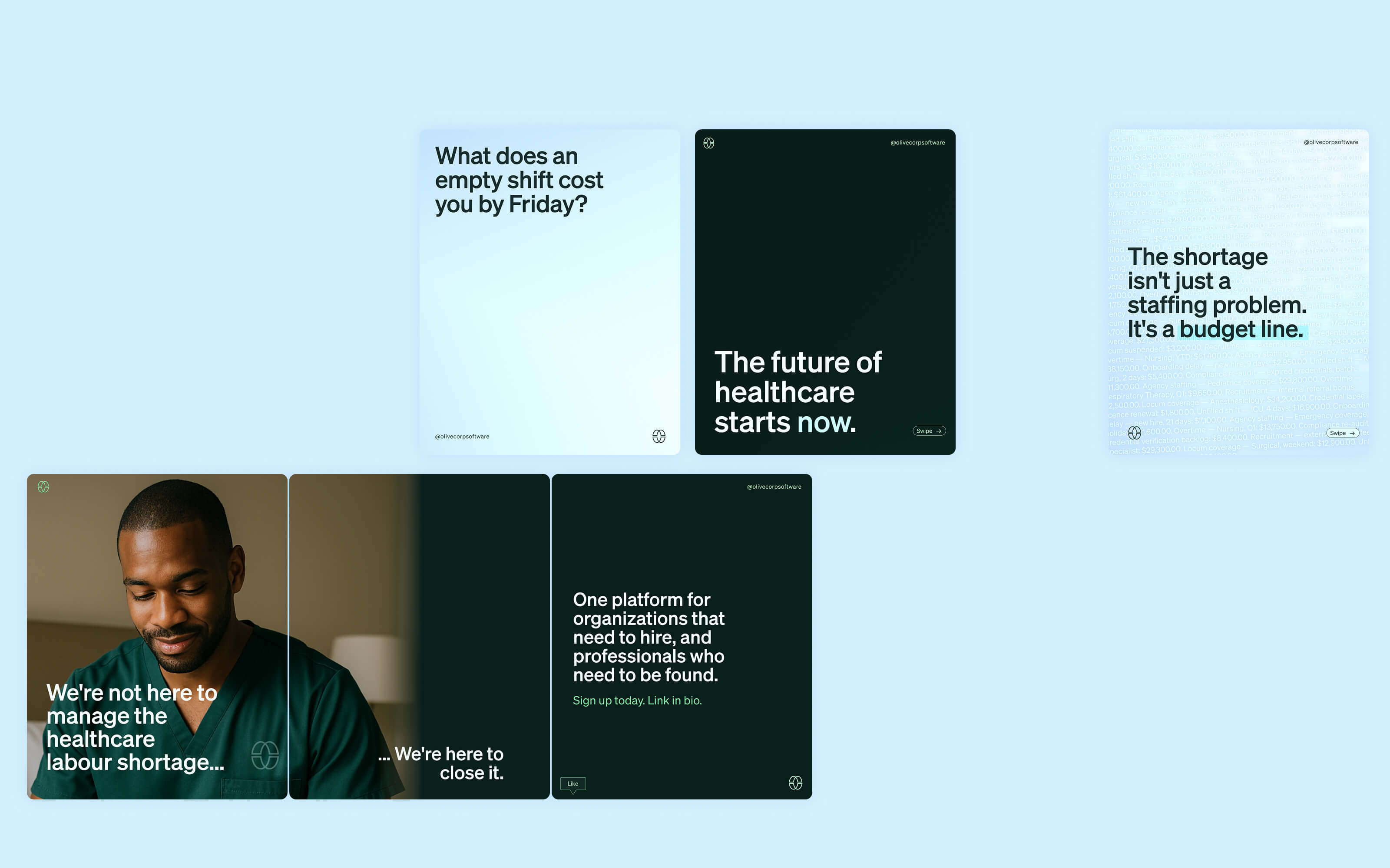
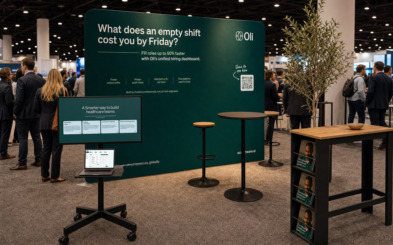
The guidelines shipped. Not long after, Oli came back — first for business cards. Then for social media graphics. Then for a custom trade show banner.
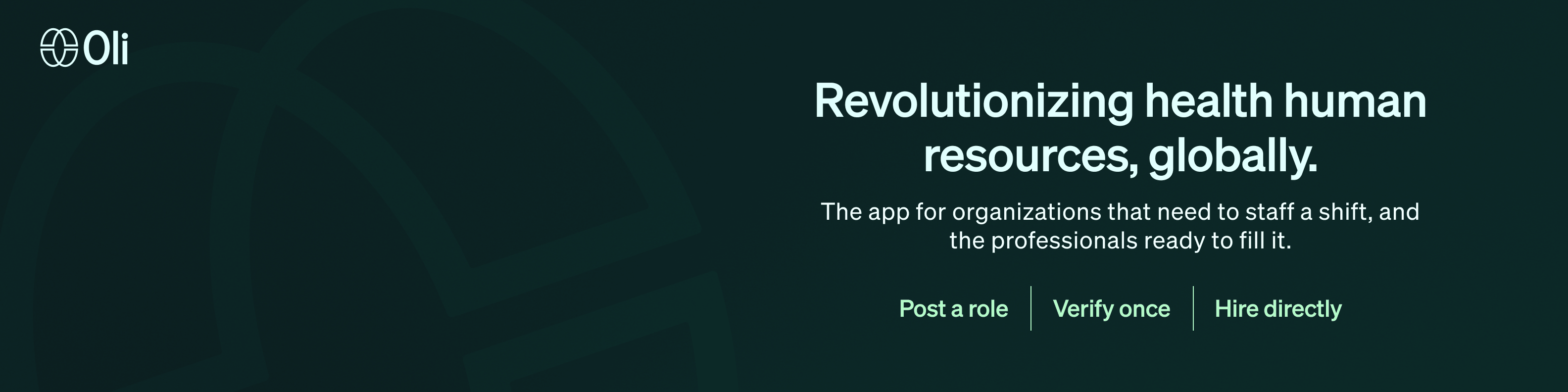
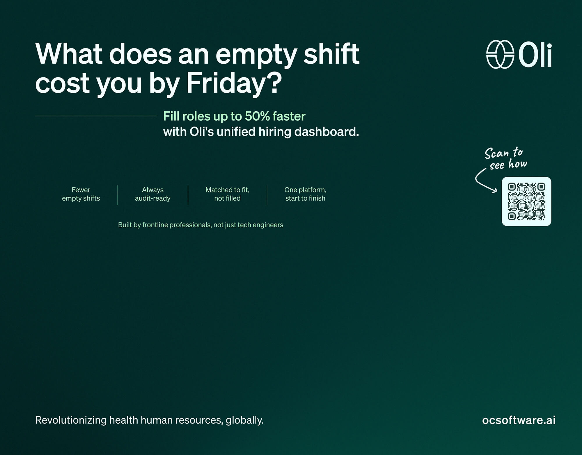
A booth is a different reading environment than a webpage. Nobody stops to finish a sentence — people are walking past, angling toward the stand, or already in line for a rep. That was the real brief: write copy that works at three different reading distances, not one.
What does an empty shift cost you by Friday? That was the question every administrator in the room was already asking. The banner just made it visible.
Each of Oli's features got rewritten to the stakes it actually solves for the person standing at the booth:
Automated hiring → Fewer empty shifts.
Verified credentials → Always audit-ready.
AI-powered matching → Matched to fit, not filled.
End-to-end management → One platform, start to finish.
Results
What’s next
An identity is never meant to stop at guidelines. Business cards, campaign visuals, a growing set of collateral — each new format has been a chance to prove the same foundation holds. A trade show floor is just the newest room it's had to work in.

