

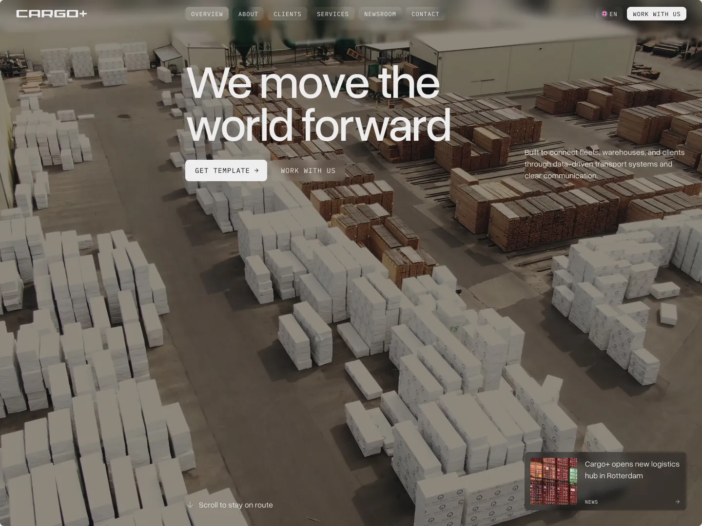
When the end user is twelve years old
Challenge
Modulate Technologies had already done the hard part. Years of research, clinically validated algorithms, a patented process that generates biomechanically optimized braces from a patient's own digital twin. The science was rigorous. The results were real.
What they didn't yet have was a way to be seen.
An early-stage startup preparing to secure funding, Modulate needed to build credibility in an industry where trust is earned slowly and skepticism is the default. But their challenge wasn't just convincing orthopedic surgeons and clinical partners. Their technology ends up on a child — most often a girl between ten and seventeen — who has to wear it for hours every day. Her parents need to feel safe. She needs to feel something closer to hope.
Three audiences. Incompatible aesthetic instincts. One brand that had to hold them all.

Approach
The starting point wasn't design. It was understanding what trust looks like to each person who would encounter the brand — and what breaks it.
That required going to the source. The process involved deep collaboration with Modulate's founder, CTO, and engineering team — not just to understand the technology, but to find language that could carry its precision into a room full of people who don't share their vocabulary. Getting the messaging right on a product this technically complex isn't a writing problem. It's a translation problem. And translation requires fluency in both directions.
A competitive landscape mapping followed — charting where every player in the scoliosis brace category sat across axes of simplicity, elaboration, tradition, and modernity. The gap was clear: the market skewed either clinical-cold or outdated. Neither spoke to a teenager who felt like her life was ending, or to the parent awake at 2am reading medical forums. The white space wasn't just visual — it was human.
From that foundation, seven detailed personas were developed across all audience groups: patients of different ages and temperaments, parents at different stages of acceptance, an orthopedist skeptical of new technology, an orthotist worried about being replaced, a nurse who sees the emotional toll up close. This wasn't a design exercise. It was strategic infrastructure Modulate could carry forward into targeted communications, product development, and future landing pages built for each group. The main site had one job: establish credibility at the center while leaving room for deeper work to come.
The position that emerged — a premium, cutting-edge solution made accessible to all through standard healthcare — held the tension deliberately. It didn't flatten the complexity. It named it.
From there, every creative decision became an argument about who Modulate is and what kind of company they are building.
Solution
A complete brand system was built across every touchpoint — visual identity, a full bilingual website, marketing collateral, and brand guidelines developed for internal teams and future partners.
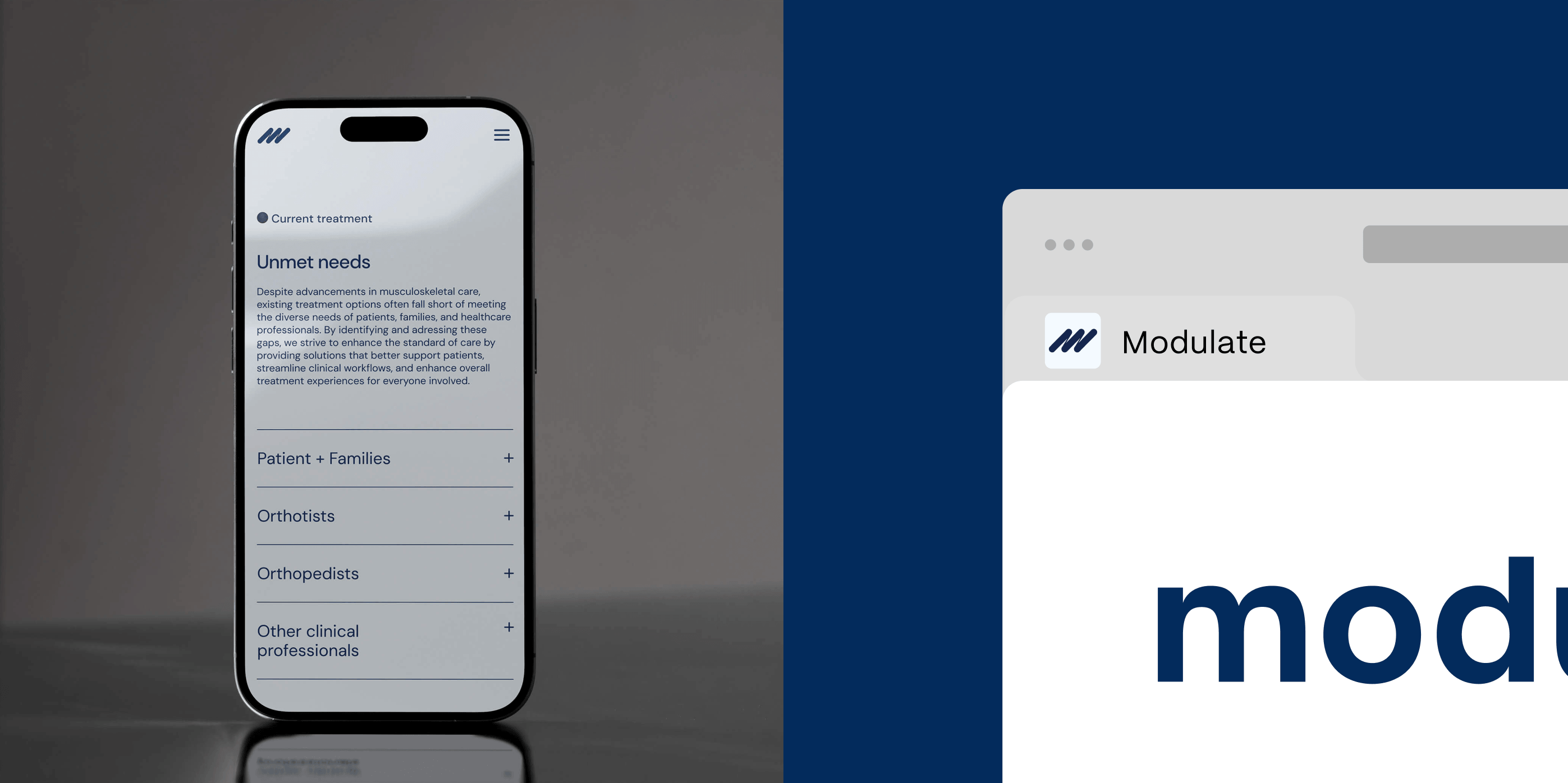
The website spans the full depth of the company: scoliosis education, the solution, the team, careers, resources, press, and more — designed across desktop and mobile.
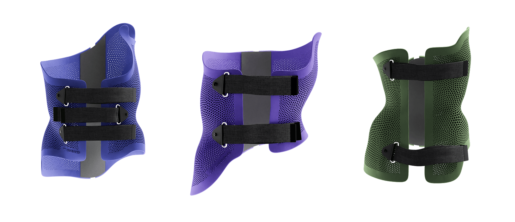
The visual identity was built around a single idea: every patient is unique, and Modulate adapts for every one of them.
The brandmark — three dynamic, diagonal strokes — communicates movement, precision, and forward momentum. It was designed with future motion in mind, even though animation wasn't part of the scope. The narrative is already encoded in the mark: the energy of something correcting, aligning, progressing. When that work comes, the foundation is there.
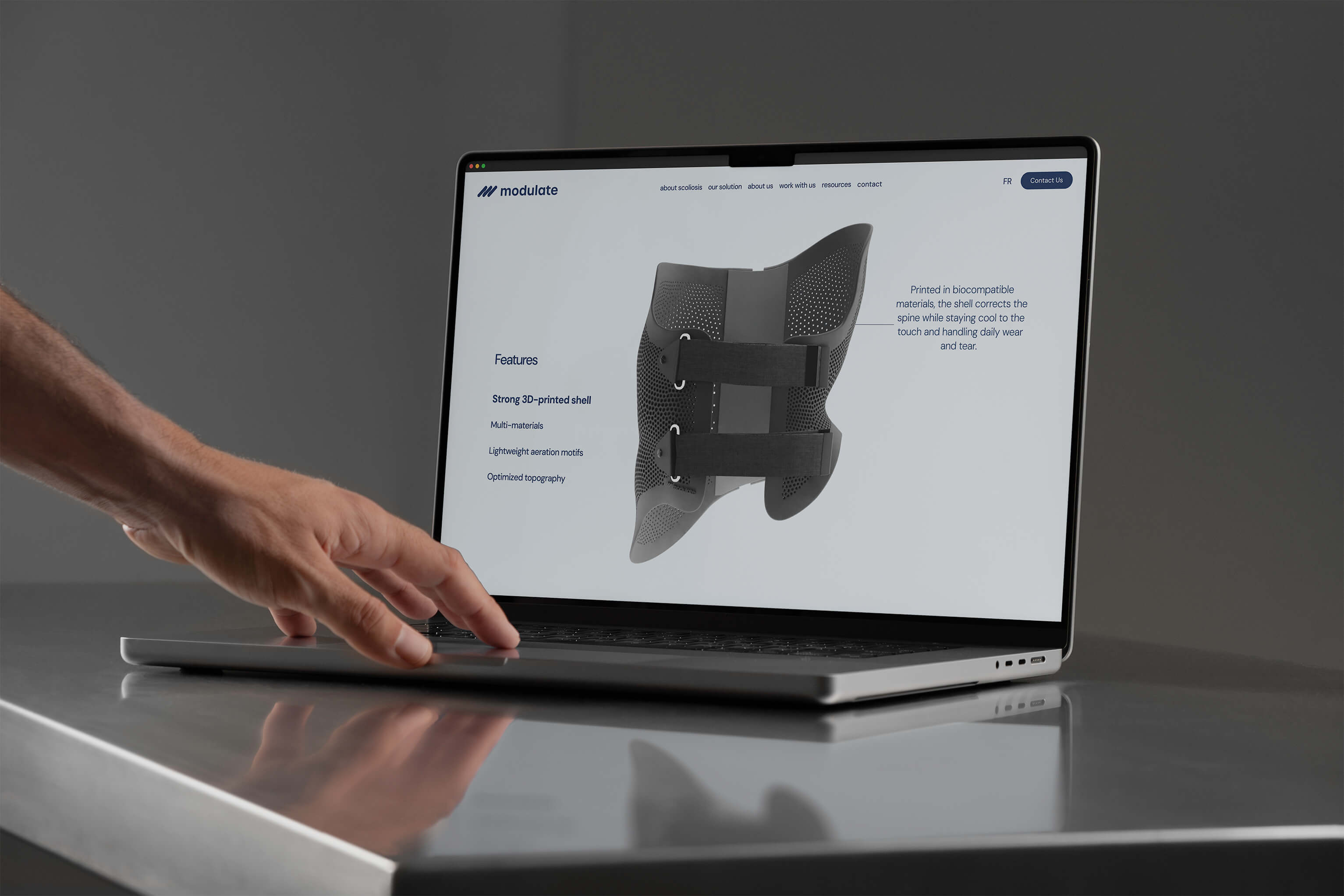
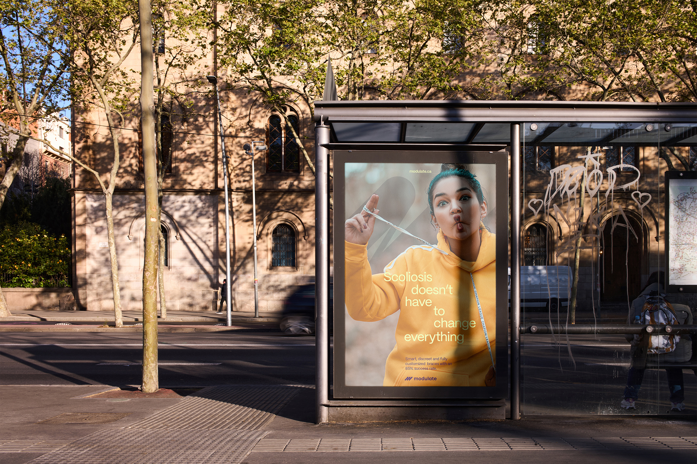
The colour palette was chosen with the same precision as the technology it represents. Deep navy anchors the brand with authority — calm, credible, clinical without being cold. Layered purples and lavenders introduce innovation and a quality that sets Modulate apart from a category still dominated by outdated visual conventions. A restrained cream grounds the layouts in warmth. And a yellow-green accent, used sparingly, does something specific: it belongs to the child. Bright without being jarring, it introduces a note of lightness into a context that can otherwise feel heavy.
Typography followed the same logic. Mori is modern and precise enough to earn authority in a medical context, while retaining a warmth that makes the brand feel approachable to a family sitting across from a clinician for the first time.
The web design, marketing collateral, and brand materials were built to move across all three audiences without flattening for any of them — professional enough to impress, human enough to reassure.
The clearest sign a brand system is working: when specialists in another discipline can pick it up and extend it without losing coherence.
Results
What’s next
The main site was always designed as a center to hold while the next layer of work becomes possible. The persona foundations are in place. The brand system can support targeted landing pages for each audience group — patients and families, clinical teams, institutional partners — each going deeper into the conversation that matters most to them.
The brand Modulate has now is built to grow into that.

